
How to find complementary colors for any color

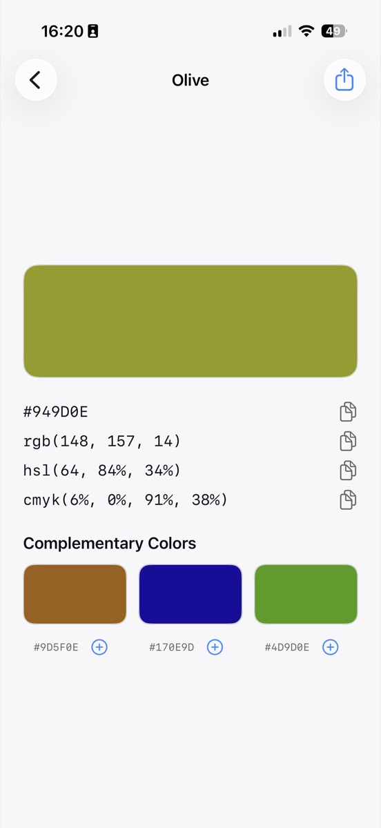
The complement of a color is the hue directly opposite it on the wheel: take the hue angle and add 180 degrees, keeping saturation and lightness where they are. For hsl(64, 84%, 34%), an olive green, the complement is hsl(244, 84%, 34%), a deep indigo. Swatchr works this out for every color you pick and shows the result as a tappable swatch.
The arithmetic, if you want to do it yourself
Convert the color to HSL, add 180 to the hue, wrap anything over 360 back round to the start, and convert back. The important part is leaving saturation and lightness alone. Rotating hue alone keeps the two colors feeling like a pair; changing all three gives you two unrelated colors that happen to be opposite.
This is also why a complement generated from a muted color is muted, and one generated from a fluorescent color is fluorescent. The relationship carries the character of the original across.
Analogous colors, and when to use them instead
A straight complement is high contrast and can be too much for a large area. The two hues 30 degrees either side of your color, its analogous neighbors, sit closer and read as a gentle progression rather than a clash.
A common approach is analogous for the bulk of a design and the complement for the one thing that needs to be noticed: the button, the price, the call to action. Swatchr gives you all three under each pick, so you can see both options against the original before deciding.
Why the complement sometimes looks wrong
Hue rotation is a mathematical relationship, not a perceptual one. Human vision is not equally sensitive across the wheel, and yellows in particular look much lighter than blues at the same lightness value. So a yellow and its computed complement can be a correct pair on paper and a poor pair on screen.
Trust your eyes over the arithmetic. Use the computed complement as the starting point, then nudge the lightness until the two sit comfortably together, which usually means darkening the yellow or lightening the blue.
Common questions
What is a split-complementary scheme?
Instead of the exact opposite, you take the two hues either side of it, usually 150 and 210 degrees from the original. It keeps most of the contrast while being easier to balance.
Do complements work the same way in CMYK?
The idea carries over but the numbers do not. Ink mixing is subtractive, so a complement calculated in HSL and then converted to CMYK is the reliable route.
Try it yourself
Swatchr reads the color of anything your camera can see, or any point in a photo, and hands you the hex, RGB, HSL and CMYK.
Download on the App Store